TL;DR
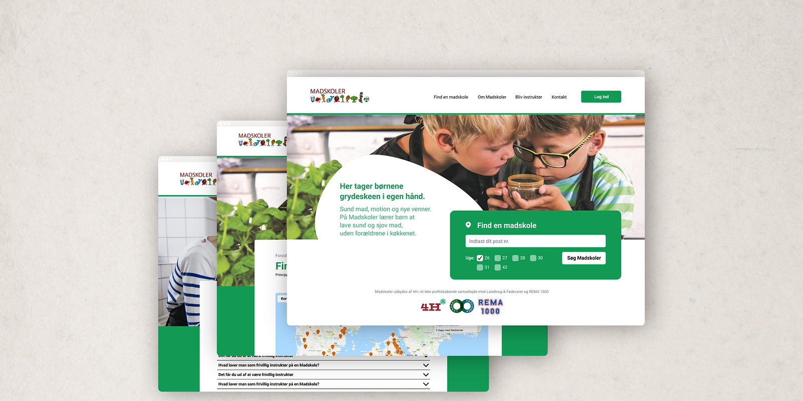
I was Product Owner and UI&UX designer on Madskoler's new website. The new site makes it easier for customers to find relevant information, and improves the overall UX.
Skills
UI Design
UX Design
Interaction Design
Figma
Project Management
Umbraco (CRM)
Team
Product Owner & UI/UX: Mike Kalsig
Developer: Jukka-Pekka Keisala
UX Researchers & UI: Jens, Anton, Niklas, Anna, Julie & Clara
Understanding the brief
Who is Madskoler?
Madskoler is a food-camp for kids, which is run by volunteers. The educational materials, organising of the volunteers, and payment-processing is all handled by the Madskoler-team, through their website Madskoler.dk.


The problem
Why does Madskoler need a new website?
Lately, Madskoler has noticed a serious uptick in inqueries and questions about information, that should be easily available on their website. A look at Google Analytics, however, has found that only 5% of Madskoler's users were able to locate what they were looking for. This has led to a high bounce-rate, meaning Madskoler has lost valuable volunteers and customers alike.
How can we change this?
For starters, we need to understand the problem from the users' perspective. What works, and what needs to change?
"I can't find what I'm looking for!"
"Why do I need this
many clicks to sign up?"
Qualitive Methods
User tests with Madskoler's current users
To get a better idea of the users' opinon on Madskoler's website, I enlisted a group of ITU students to conduct user tests.
The tests brought valuable insights into the Madskoler-users' expectations on where to find things. Among the most important findings, we learned that:
- Lack of headlines makes it hard to navigate the information.
- Detailed explanations can be overwhelming to some users.
- 43% of the (elderly) users were scared to click on the nav-bar, because they didn't know what would be behind it.
- It takes WAY too many clicks to sign up to be an instructor.
The solution?
A new UI with better headlines, a structured information-architecture, and better CTA-buttons.
New UI
Better Nav-bar
The new nav-bar makes it easier to get an overview of the different sections on the site.
New UI
Clear Structure
A new H-structure on the site makes it easier to navigate the text and finding information
New UX
Better CTA-button
The new Call To Action button appears on relevant pages, and follows the user as they scroll.


